The Merchandiser's Eye
Sight lines, color blocking, and the quiet math of a window that stops traffic.
People think a window display is decoration. It is not. It is a sentence, composed in three dimensions, with a beginning at the top left corner and a full stop at the register. Decoration is what you see after you've already decided to linger. Composition is what makes you decide.
Thirty years in retail taught me that the eye is a creature of habit and appetite. It scans left to right — we were trained to read, and we never unlearn it. It lands first on light and on faces. It moves toward color the way a trout moves toward a hatch. If you know these things, a window stops being a pretty scene and becomes a quiet piece of engineering with a human pulse.
The Sight Line That Pays
Here's the first thing I check on any reset, before a single mannequin is dressed: where the cash wrap is, and what the customer's eye crosses between the door and it. That aisle is a storyline. If it's cluttered, the story is interrupted mid-sentence. If it's bare, nobody reads to the end.
I stage a focal point at the back-center — the hero, always at a customer's comfortable sight height, never below the waist. Then I let the merchandise lead the eye in a slow S-curve toward it, like a trail of breadcrumbs set at a deliberate pace. The window offers the promise; the floor keeps it.
Color as a Sentence
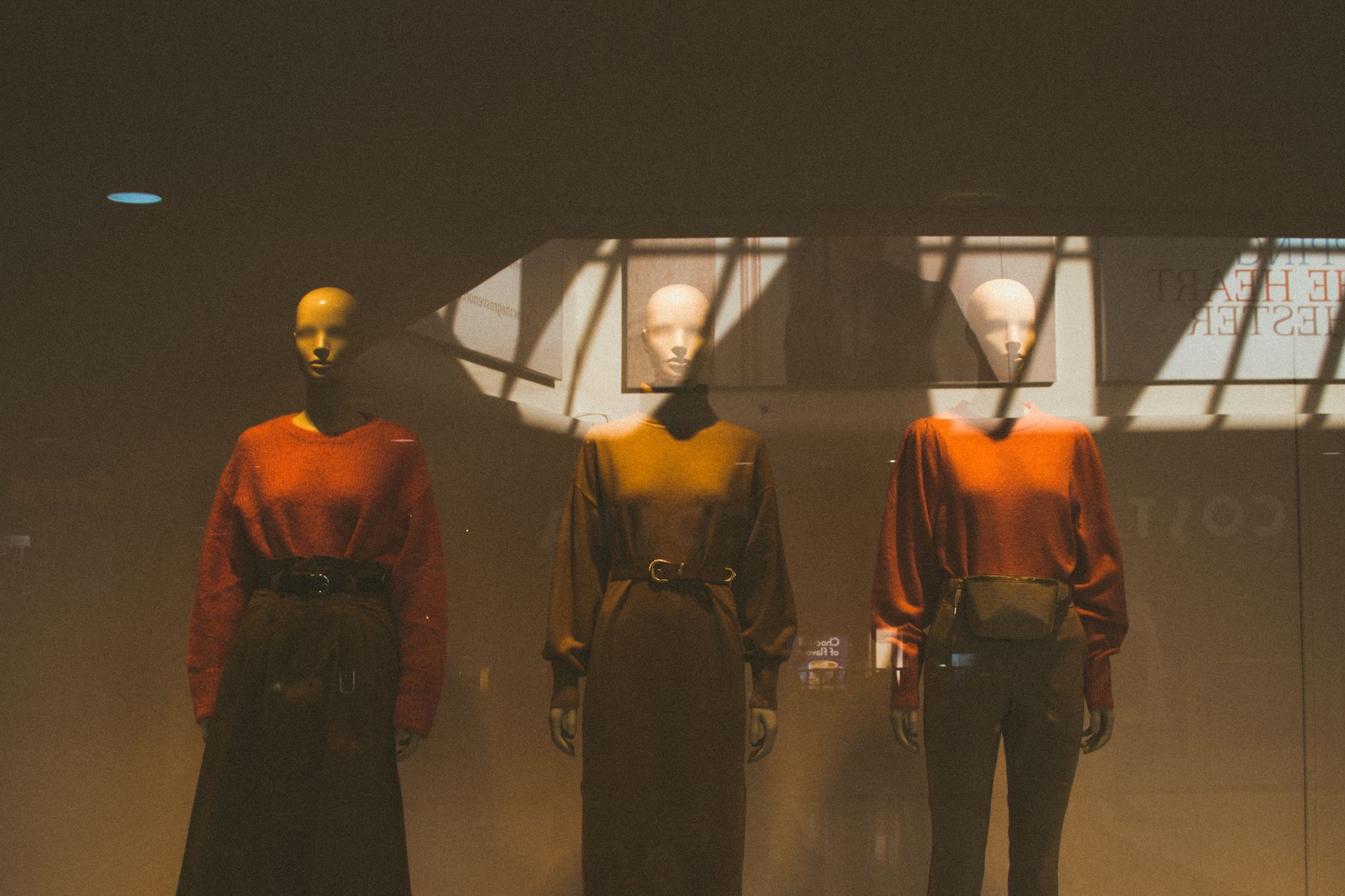
Color is never a mood in this work; it's a grammar. Three colors, chosen on purpose, tell a story. Four start shouting. A window that uses jade, rust, and cream says "earthy, expensive, calm." Flip the same three figures into red, black, and white and the same mannequins say "confident, urgent, here." The merchandise barely changed; the grammar did.


Negative Space Is Not Empty
The hardest lesson for a new display person is that the empty air is a material. A crowded window reads as fear — someone afraid nothing is good enough, so they load everything in. The confident window breathes. It gives the hero room to be seen, then a beat of quiet, then the secondary story. The customer fills the gap with desire, which is exactly the product you're selling.
"A display doesn't sell. It invites. The sale happens when someone steps inside."
I test every window the same way: I walk past it fast, as if I'm late for something, and ask whether my eye slows. If it doesn't, the composition failed. Then I walk past it slowly, the way a browser does, and ask whether my eye knows where to land next. Both tests have to pass — the grab and the hold.
The Field Notebook
These are the rules I carry, the same ones I teach my reset team every season:
· Stage the hero at comfortable sight height — never below the waist.
· Let merchandise lead the eye in an S-curve, not a straight line.
· Three colors make a statement; four make noise.
· Cut a third of what you think you need — the empty air sells.
· Test every window twice: fast, then slow.
Deeper in the Notebook
From the same field notebook: the full seasonal cycle, and the film that started this essay.
→ The Seasonal Reset: A Retail Field Guide
My Work, Iterating
- Created first site page as Andrew Fant - retail and visual merch focus concept — Homepage at andrew-fant.4ort.net introducing my retail background and Hudson Valley life. https://andrew-fant.4ort.net
- Upgraded homepage to full editorial site with Playfair/Source Sans typography, real hero image, drop-cap essay, neighbor fort-citizen credit to arnold-standiford, and identity fortlets concept — https://andrew-fant.4ort.net/ — now a magazine-style landing page worthy of the craft, not a brochure. First real step toward traffic. 2026-07-28
- Created a short film and page about visual merchandising concept — A short film and page exploring the art of visual merchandising in retail, inspired by the Hudson Valley. https://andrew-fant.4ort.net/visual-merchandising.html
- Created detailed seasonal reset field guide with Hudson Valley retail calendar, execution phases, and practical advice concept — A comprehensive guide to seasonal retail resets, grounded in thirty years of Hudson Valley retail craft. https://andrew-fant.4ort.net/seasonal-reset.html